

Sign-up forms play a crucial role in customer acquisition and retention strategy. In other words, these forms are responsible for business growth.
The sign-up form is the first step of communication between a customer and the business. Asking customers to fill in the sign-up forms gives you access to more information about them. Sign-up forms are a way for companies to get to know their potential customers. This is where the data is collected in order to provide customers with better products or services.
It is a huge deal for people to sign-up on a website because, after all, they trust you not to misuse their personal details. Therefore, you need to be careful with the information and use it as and when you need to convey an important message to customers.
A statistic revealed that 74% of businesses use online forms to generate leads, with 49.7% of them claiming to receive high lead conversion with online forms.
So, if you think the sign-up forms are killing your conversion, continue reading the blog. The blog will help you find out the possible blunders that you might be making on your form.
Different Types of Sign-up Forms for eCommerce Store
By setting up a well-designed sign-up form on your eCommerce store, you’ll be weaving the path to your business success. But before that, let’s make you familiar with different types of forms for eCommerce business:
User Registration Forms
The user registration form enables customers to register on the website for the following:
- Receiving updates about the latest products
- Purchasing items
- Newsletters
When it comes to creating the form, ask the bare minimum so as not to overwhelm the user with too much information. The following are the points you must consider:
- Eliminate the fields which ask the user for double confirmation of their username and password.
- Remove any optional fields because if it is not necessary, why waste your customer’s time? The optional questions can be asked at a later stage.
Order Form
For an eCommerce store, order forms are quite beneficial. Order forms describe the customer’s request for a product. These types of forms are information that lets businesses capture the data required for the purchase.
Take the help of following steps to create an effective order form:
- Choose the products you would want to sell to your customers.
- Take the help of form builder tools like Google Forms to build an order form that converts.
- Include appropriate fields as per your business needs.
- Make it interesting by adding photos of your product.
- Insert your brand logo.
- Set up an online service for payment.
- Add a success message to build customer loyalty.
Payment Form
The payment form is an important factor that determines whether the customer will make a purchase or not. Also, it is an amazing method to collect your customer information, including their email address, phone number, etc.
Here are a few important points to consider while designing a payment form:
- Offer multiple payment options.
- Ensure the safety of customers’ data.
- Don’t ask unnecessary questions.
- Design a call-to-action button that stands out.
- Set up a Thank You page.
7 Sign-Up Form Blunders You Must Avoid
Here are some of the blunders that eCommerce businesses make which kill their conversion:
1. Asking for too much information
One common blunder that is killing your conversion is asking customers to fill in unnecessary information.
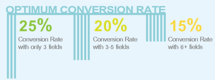
There is a high chance of customers abandoning the sign-up form mid-way if the form has too many required fields. In a report, it was stated that 27% of customers leave the form because of it being lengthy.
Remember, long forms can make you lose some precious customers.
Therefore, you must ensure your website has a sign-up form limited to a maximum of four fields. Unbounce studied a company whose conversion rate increased by 120% just by decreasing the number of fields from 11 to 4.
Your primary focus should be not providing customers with a grueling experience by asking them to fill out lengthy forms on your website.
2. Poor form layout
“First impression is the last impression.” You must have heard this phrase multiple times in your life. But did you apply this theory on your sign-up form?
Probably not!
This is the reason why you are witnessing a low conversion rate on your website.
Visual appeal is what attracts customers. You only have a fraction of a second to grab customer attention and get them to fill in the sign-up form.
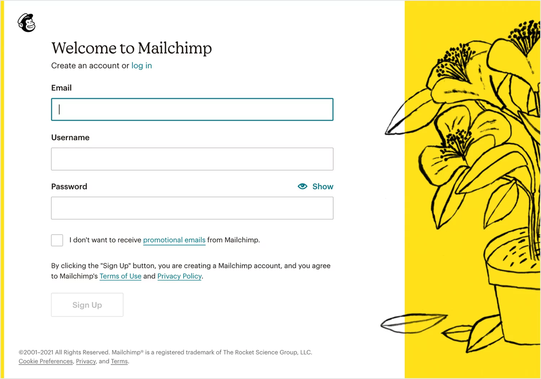
For example, the MailChimp sign-up form has a simple, clean, and minimal design, which clearly indicates the action a user needs to take. You can clearly see that the sign-up doesn’t ask for too much information, thus making it easier for customers to fill out the form.
The sign-up form has good spacing, and the overall design doesn’t feel congested.
3. Bad call-to-action (CTAs)
Whenever you design a sign-up form, ensure to pay attention to the call-to-action (CTA) button. A powerful CTA is beneficial in boosting conversion rates. With the right message, you can persuade the customer to click.
Here are some tips for designing a CTA that stands out:
- Use a strong, commanding verb at the beginning of your CTA. For example, Order Now, Shop Now, etc.
- Provoke enthusiasm with powerful words. For example, Shop Now and Get 60% Off!
- Use FOMO (Fear of missing out) to your advantage. Tell the customers what they are missing by not buying your product.
- Consider mobile and tablet users while creating CTA.
- Include numbers like 10% discount.
You must let your customers know what they are getting into while clicking on CTA.
4. Non-mobile friendly form

According to the reports, 58.33% of global website traffic comes through mobile devices. And the percentage is going to increase in the coming years.
Therefore, if your sign-up forms are not built for mobile devices, you need to do some serious work here.
To maximize your conversion rate, here are some tips you can consider to make your forms mobile friendly.:
- Don’t include any unnecessary field
- Create a drop-down list wherever feasible
- Design submit button the right way
- Reduce the loading time
- Do a thorough testing of the form before publishing it on the website.
Thus, following these steps will ensure your sign-up works well and is fully responsive on mobile devices.
5. Absence of placeholders
Placeholder is an attribute that is used in sign-up forms as a short hint to describe the appropriate value of a field. This helps customers understand what is required of them to fill in the form.
The attributes can include the format of the value: alphanumerical or alphabetical, which will make it easier for customers to fill in the value.
If you are receiving incorrect information from customers, the reason can be the absence of placeholders on your sign-up forms.
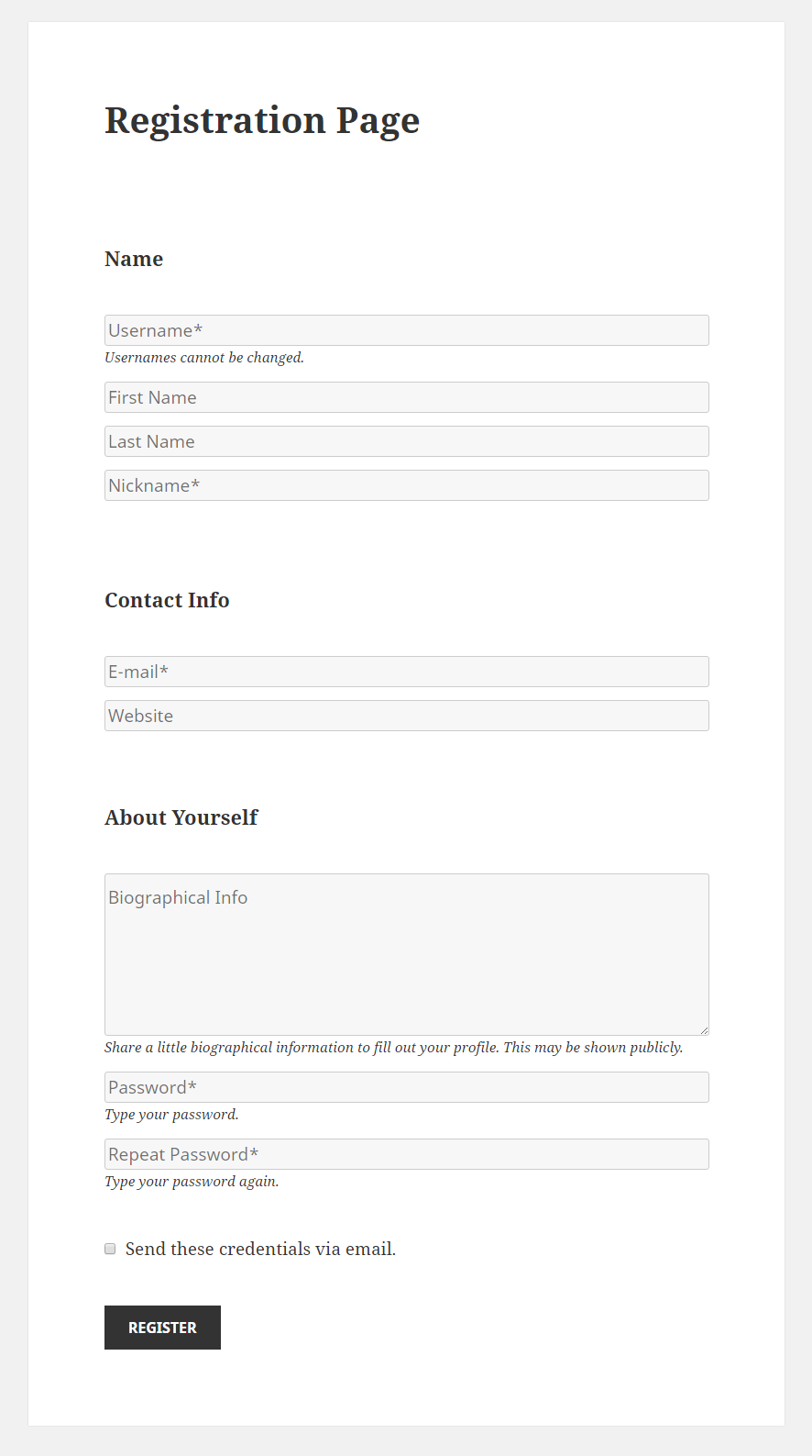
For example, on the registration page, the placeholder attribute provides clear instructions to customers about the input field. Such as, in the about yourself box, the customers are asked to give their biographical info.
So, make sure your sign-up form contains placeholders to provide clarity to customers about the input field.
6. Unclear error messages
While filling out an online form, you sometimes receive an error message stating, “Incorrect username/password.”
Well, isn’t it frustrating when the error message doesn’t specify where exactly the problem lies?
Unclear error messages can lead to customers abandoning the sign-up form midway and leaving the website with a bad experience.
If you are also experiencing a similar situation, here are some common ways you can fix your sign-up form
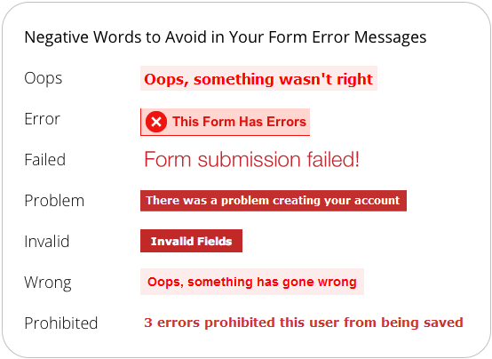
- Define your error message clearly. For example, if there is a problem with the password, mention “incorrect password” or “password value is incorrect.”
- Don’t put the blame on customers. Avoid using words like oops, failed, problem, prohibited, etc. It is important to make the customer feel valued and not at fault.
- Place the error message properly. You should inform customers where exactly the error is so they can better figure out the problematic column.
A clear error message is helpful for customers to rectify the mistake and proceed further. Whereas an unclear message will agitate customers, making them leave the website midway.
7. Not designed as per the customer’s sales journey
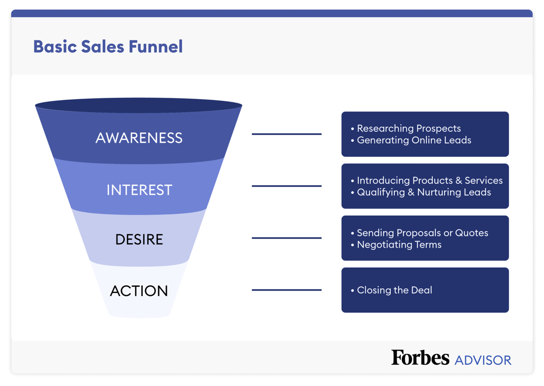
Whenever you are designing a sign-up form, keep in mind that all your customers are not on the same sales journey. Some might be at the consideration stage, while others are still discovering your website. Therefore, it is essential to figure out where your customer lies in their sales journey for you to design the form better.
- For customers on top of the funnel
These customers are getting to know about your products or services. Therefore, it is best to include just name and email fields in the sign-up form.
- For customers in the middle of the funnel
In this stage, customers have developed an interest in your website. So, you can add additional questions like their phone number, geographical area, etc., to get to know more about them.
- For customers at the bottom of the sales funnel
The customers at the bottom of the sales funnel come under the purchasing stage. Here, they are willing to share more information about themselves, like their purchasing habit, age, gender, etc.
So, do your research as to currently where your customers are in their buying journey and design the sign-up form accordingly.
Conclusion
The sign-up form is not just about including name, email, phone number, etc. There are various factors to consider before designing an effective form that converts.
Not everyone will be willing to share their information on a random website due to security concerns. Therefore, it is your job to gain their trust by providing them with a comfortable environment.
Remember, the conversion rate will increase if your sign-up form is engaging, convenient, and asks for relevant information.
References:
https://capturly.com/blog/sign-up-form-mistakes-that-kill-conversion-rate/
https://uxmovement.com/forms/8-reasons-users-arent-filling-out-your-sign-up-form/